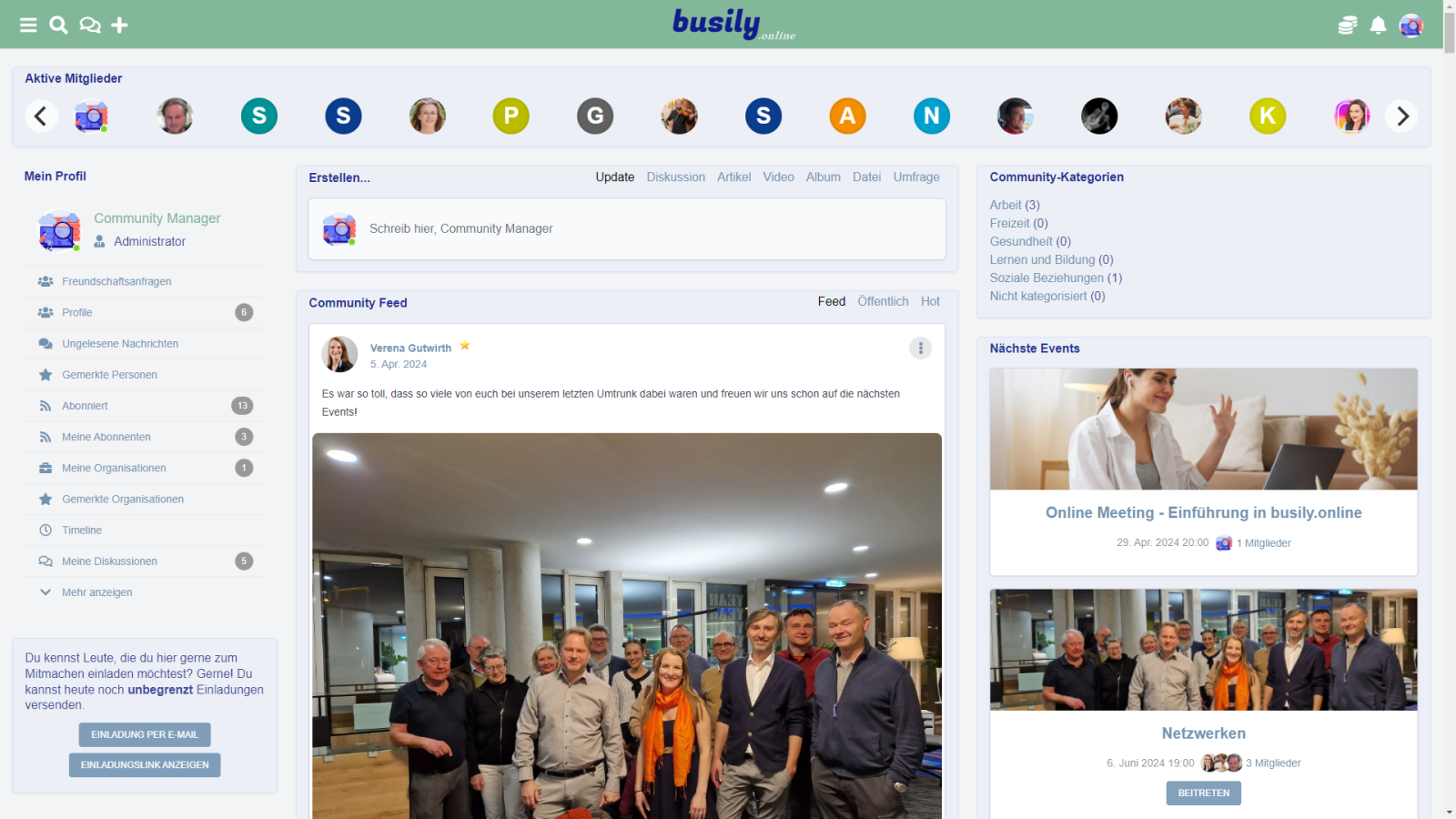
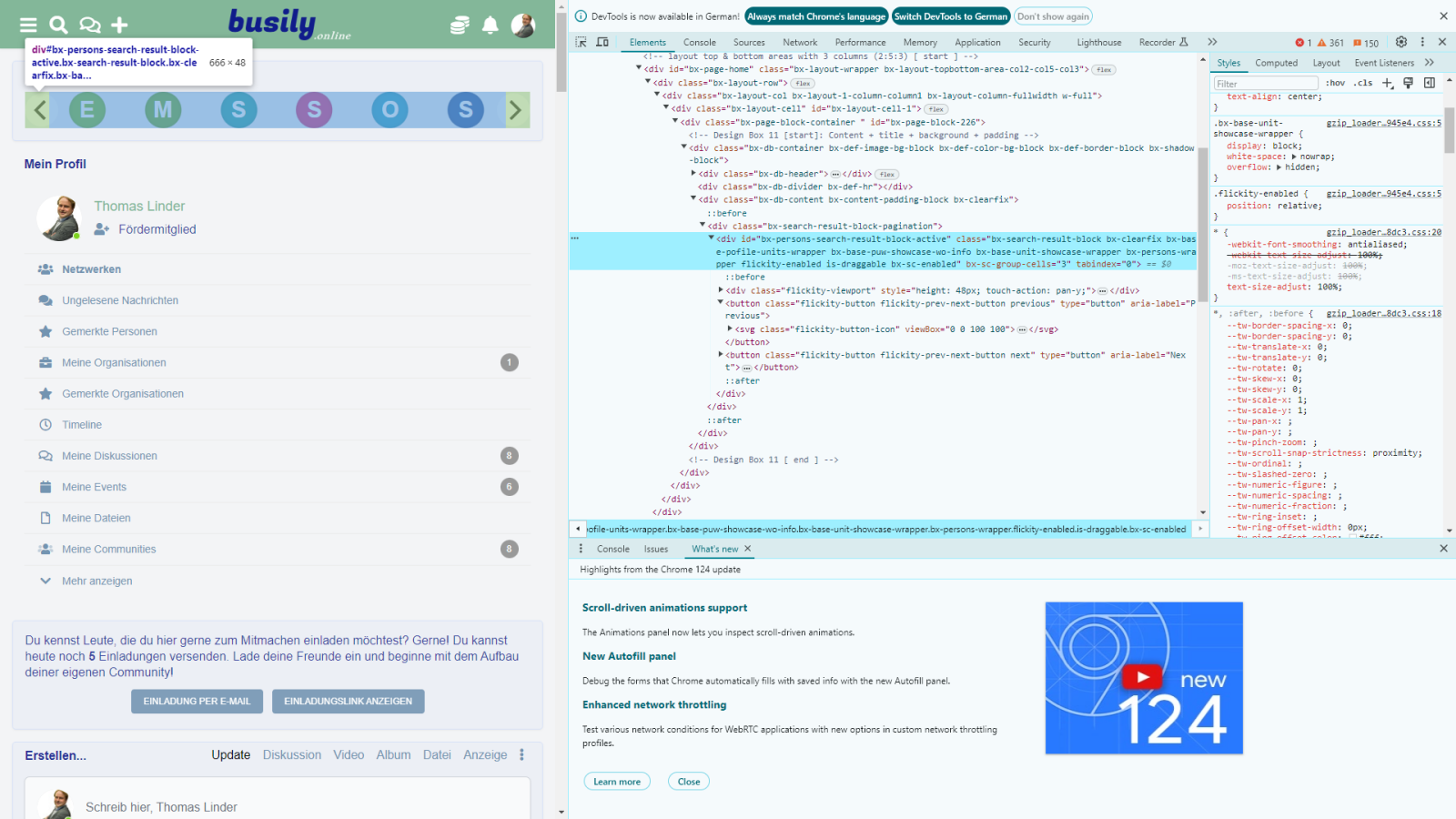
Pls notice that in the active people showcase view it has arrows on either end to scroll around. Unfortunately the arrows cover the people at either end of the showcase bar and you cannot click on them. Could we please move the arrows outside the bar gui? This is on the latest A3 build....
@thomlin, Looked up that article, and while it did solve the issue, the OP neglected to post WHAT he changed in the CSS to fix it, making his post rather useless to us that know nothing about how to modify CSS code...
Sorry, the comment was in reply to Leonid's comment. Here's the screenshot of the startpage on my liveserver running version 13.0.0 with the linked style fix working in the carousel. I don't know why it returns back in version 14.0.0-A3.
Ok, I'll quickly admit I'm not really good at understanding how CSS works, but I can duplicate changes if I know what to make. I went back over the post, @LeonidS post, and the flik link he gave, but I still have no idea what to change, or where to change it. Not everyone who runs UNA has a degree in website production, and I am one of them. Could you pls post your CSS code change and where to actually change it at?
Just checked it on my testserver running latest Alpha version. The fix is still working, see screenshot. So, anyway, Leonid should have a look at your config. I can provide you with the necessary css as a quick fix later, when I'm on my computer at home.
I assume that you are using Artificer template. So, try this: In Studio klick on Artificer Module, then klick on "Styles". In section "Custom Styles" copy this:
Note, that's just a quick and dirty fix. Maybe you have to adjust the padding px a bit. Since I use the Protean template, the dev's fix for that issue I reported is still working.
Hello @sfraden !
It is the feature of the Flickity https://flickity.metafizzy.co/
T
But that issue has been solved long time ago. https://unacms.com/d/flickity-caroussel-missing-margin
S
@LeonidS , The bug is a feature? How do I use that to correct it?
S
@thomlin, Looked up that article, and while it did solve the issue, the OP neglected to post WHAT he changed in the CSS to fix it, making his post rather useless to us that know nothing about how to modify CSS code...
T
Sorry, the comment was in reply to Leonid's comment. Here's the screenshot of the startpage on my liveserver running version 13.0.0 with the linked style fix working in the carousel. I don't know why it returns back in version 14.0.0-A3.
S
Ok, I'll quickly admit I'm not really good at understanding how CSS works, but I can duplicate changes if I know what to make. I went back over the post, @LeonidS post, and the flik link he gave, but I still have no idea what to change, or where to change it. Not everyone who runs UNA has a degree in website production, and I am one of them. Could you pls post your CSS code change and where to actually change it at?
T
Just checked it on my testserver running latest Alpha version. The fix is still working, see screenshot. So, anyway, Leonid should have a look at your config. I can provide you with the necessary css as a quick fix later, when I'm on my computer at home.
S
Thanks, I appreciate it.
T
I assume that you are using Artificer template. So, try this: In Studio klick on Artificer Module, then klick on "Styles". In section "Custom Styles" copy this:
.bx-base-unit-showcase-wrapper {
	padding-left: 55px;
	padding-right: 55px;
}
Note, that's just a quick and dirty fix. Maybe you have to adjust the padding px a bit. Since I use the Protean template, the dev's fix for that issue I reported is still working.
S
PERFECT! Yes, that worked! thank you for providing the solution & the how to.....
T
No problem. The devs will certainly provide a better and durable solution for fixing layout issues in Artificer https://github.com/unacms/una/issues/4698